Add Dark Mode to your site

Hello amazing folks 👋
I'm going to teach you how you can add Dark Mode to you website. And save people's precious eyes.
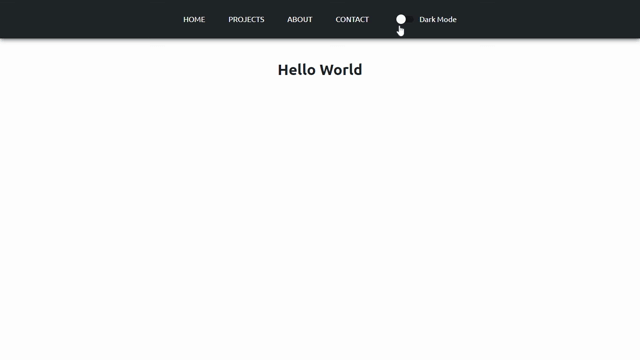
We will make a toggle in React to switch to dark mode. As shown below.
Loosen up your seatbelt cause it's going to be an easy tutorial.
So let's get started.
1.) Create React App
First, create a React App project in your local system and open it in any code editor that you prefer (I will be using VScode).
2.) Create A Navbar
Open App.js file in src folder and delete all the boilerplate code and empty whole file. Now you have an clean slate to write your code. Now first we have to import some important files.
- Import react in your project
import React from "react";
- Import Css file
import "./App.css";
Now we will create a functional component in App.js itself and add a navbar in it and export it.
It will look the following screenshot :
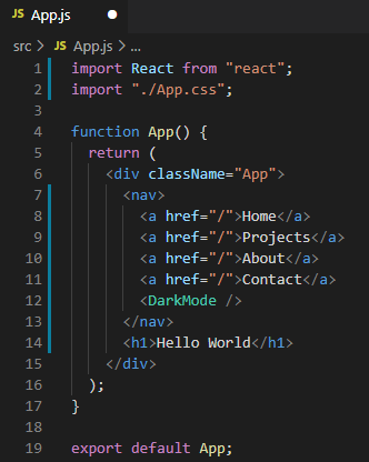
I have created a Navbar and added some links and a header in it, just to make it look good.
3.)Create new component
In src folder, create a new folder called "components". And in "components" folder, create a new file called "darkMode.js".
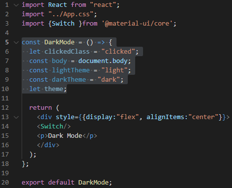
- In darkMode.js we will import React and Css file.
import React from "react";
import "../App.css";
Now, we will use a Basic Switch form Material UI to turn dark mode on and off. If you don't know about Material Ui, you can click here to learn more.
- Import Material Ui To import material ui, open your code editor's terminal and run following command.
npm install @material-ui/core
It will take some time to import.
- Import Switch from Material Ui
import { Switch }from '@material-ui/core';
Now create a class component and add that switch in it.
  return (
    <div style={{display:"flex", alignItems:"center"}}>
    <Switch/>
    <p>Dark Mode</p>
    </div>
  );
I've added some styles in div to make it more responsive.
Now for everything to work, we have to set up few properties.
It will look the highlighted part in the following screenshot :
 In above image:
- We have to reference the body so we can apply styling to it once we click the dark mode button
- Light theme and Dark theme are going to be the class names that we will apply to the body.
- Theme is a local property which we will use to handle the currently selected mode.
- The clicked class is going to be applied to the button when we click on it.
4.) Setting Up The Logics
  if (theme === lightTheme || theme === darkTheme) {
    body.classList.add(theme);
  } else {
    body.classList.add(lightTheme);
  }
In 'theme' property will be expecting to find one of the two values 'light' or 'dark'. Because these are the values we will be setting in our theme. And if we find such value we will add that css class to the document body and if not we will default to not using the dark mode by setting the light class. (if you want dark mode as default value you can do that too)
    <Switch
    className={theme === "dark" ? clickedClass : ""}
    id="darkMode"
    color="primary"
    onClick={(e) => switchTheme(e)}/>
- Now to make our Switch(button) do something on click we need to set up an onClick event for it which will call the switch theme function which we don't have yet but we will define this function later in this tutorial.
- We will also add id to it so we can style it later.
- And we will add clicked class to it if the dark mode is on.
5.) Switch Theme Function
The switch theme function is going to check which theme is currently active and do couple of different things depending on that.
  const switchTheme = (e) => {
    if (theme === darkTheme) {
      body.classList.replace(darkTheme, lightTheme);
      e.target.classList.remove(clickedClass);
      theme = lightTheme;
    } else {
      body.classList.replace(lightTheme, darkTheme);
      e.target.classList.add(clickedClass);
      theme = darkTheme;
    }
  };
If the dark mode is currently on, it will replace the dark theme body class with the light one. It will remove the clicked class from dark mode button/switch. Finally we will set the theme property to light theme since the dark mode will no longer be active. And if dark mode is off, we will want to turn it on. To do that we will do almost same thing as before. We will replace light mode to dark mode and set the theme to dark.
With this our component is finished and now we can import it in our App.js file.
import darkMode from "./components/darkMode";
And add darkMode component in the navbar our functional component.
<DarkMode />
6.) Setting Up Css
To change between two different looks, we will use Css Variables.
- We will add two color variables for both light and dark mode in the root selector.
:root {
  --black: rgb(33, 37, 41);
  --white: rgb(255, 255, 255);
}
We've added black color for text and white for background in the light mode.
We will switch between them as the mode changes. To do so, we will add more css variables inside of the 'light' class selector which will use the variables from the root.
body.light {
  --background-color: var(--white);
  --text-color: var(--blue);
  --font-weight: 400;
}

body.dark {
  --background-color: var(--blue);
  --text-color: var(--white);
  --font-weight: 500;
}
- Now that we have light and dark mode classes set up. We will use them in body.
body {
  background: var(--background-color);
  color: var(--text-color);
  transition: background 0.3s ease-in-out, color 0.6s ease-in-out;
}
I've added transition which will look good when we will switch mode. If you want to take this styling further you can also add some styling for navbar etc to make it look good.
nav {
  padding: 1rem 25%;
  margin: 0 auto;
  display: flex;
  justify-content: space-evenly;
  align-items: center;
  background: var(--text-color);
  box-shadow: 0px 1px 10px 0px var(--text-color);
}

nav a {
  text-decoration: none;
  text-transform: uppercase;
  color: var(--background-color);
}

p {
  color: var(--background-color);
}

h1 {
  text-align: center;
  margin: 3rem 0 2rem 0;
}
And voila!
You now have your own functioning dark mode switch built in react.
If you want to take a look at the code you can check my github here .
Thanks for reading 😃
I would ❤ to connect with you at Twitter | LinkedIn | GitHub
Share your queries in the comments section.


